Leaving accessibility to the last step of a web project, as a checklist or audit just before launch, finds barriers when they are hardest to remove. Many of them were decided weeks earlier, in a color palette, a component, a content model or a vendor contract. Build accessibility into each stage instead, an approach often called shift-left accessibility, and let the final check confirm what you already know.
Here is a fictional but familiar example. A small online shop is redesigned over six weeks of design and eight of development. Two weeks before launch, an accessibility audit arrives with dozens of findings. Most trace back to five decisions: a pale gray for secondary text, a custom size picker, a filter panel built from generic div elements, a product editor with nowhere to write alt text, and a third-party reviews widget. The team fixes what fits before the date. The rest becomes a ticket labeled “after launch.”
None of those decisions was careless. Each was made at a stage where nobody had asked about accessibility yet, by someone who would never see the audit.
How common is leaving accessibility to the end?
Common enough to measure. For its State of Digital Accessibility Report 2025–2026, Level Access asked 1,622 professionals, mostly senior staff at large organizations in the US, UK and EU, when their organization typically begins addressing digital accessibility. The survey was run by Vanson Bourne in July and August 2025.
| Answer | 2025 survey | 2024 survey |
|---|---|---|
| Planning | 28.1% | 29.0% |
| Design | 27.5% | 32.3% |
| Development | 23.7% | 23.5% |
| QA and testing | 12.9% | 7.7% |
| After going live | 5.0% | 5.7% |
| Not typically addressed | 1.5% | 1.2% |
| Don't know | 1.3% | 0.6% |
In 2025, 41.6% began once development was under way or later, up from 36.9% a year earlier. Level Access describes the data as “largely stable year-over-year,” with two notable shifts: fewer organizations starting in design, down 4.8 points, and more starting at QA, up from 7.7% to 12.9%.
The report also points to a gap between intent and practice. While 56% said they begin in design or earlier, only 28% reported using designer tools. In Level Access's words, for many organizations proactive accessibility “may remain conceptual rather than operational.”
These are self-reported answers from large organizations, so they describe habits rather than measured outcomes. Even so, a growing share of teams start on accessibility at the QA stage, when the product is nearly built.
Where accessibility barriers really start
An audit reports symptoms page by page. Trace each one back and it often leads to a decision made at an earlier stage.
| What the audit reports | Where it was decided | When it was cheapest to settle |
|---|---|---|
| Low-contrast text across many pages | A color in the brand palette or design tokens | In design, before components used it |
| A custom dropdown that keyboard users cannot operate | Building or choosing the component | Before it was reused across forms |
| Images with missing or unhelpful alt text | A CMS with no alt text field or decorative option | When the content model was set up |
| New screens that are not announced and leave focus behind | Client-side routing in a single-page app | When routing was first built |
| Errors identified only by red text or borders | The design of form error states | In design, alongside the error copy |
| Videos without captions | The budget and schedule | In planning, as a line item |
| A sign-in page that blocks pasting a password | The authentication flow | In product decisions about sign-in |
| An inaccessible booking or chat widget | Choosing the vendor | In procurement, before the contract |
As a project moves on, two things happen to each of those decisions. It gets copied: a color into hundreds of components, a widget into every form. And the people who made it move on to other work. When the audit finally arrives, its findings land on whoever is still there, usually developers working toward a launch date. W3C's draft guidance on accessibility roles describes the result:
When accessibility is left until late in a project, the responsibility often falls on developers. Then they end up handling tasks that are not in their skillset — for example, selecting colors, describing images, and writing headings.
Fixes made under those conditions tend to be patches rather than repairs: an override on the one page the audit flagged while the design token stays the same, or ARIA attributes added to a custom control instead of replacing it with a native element.
Why a final accessibility check comes too late
Even a thorough pre-launch audit runs into three problems that have nothing to do with the auditor's skill.
The launch date wins the argument
Findings that arrive two weeks before launch compete with the date, and the date usually wins. Quick fixes ship. Structural ones, such as the custom component, the palette or the vendor, move to a backlog, where they compete with new features.
The cost shows up after launch. By the time a deferred finding reaches the top of the backlog, the component behind it has been reused elsewhere, and people have been running into the barrier all along.
A checklist only checks what it lists
A final checklist drifts toward what can be verified quickly: images have alt attributes, fields have labels, text passes a contrast ratio. Those checks matter, and tools already handle many of them. Playwright's documentation is direct about the rest: “many accessibility problems can only be discovered through manual testing.”
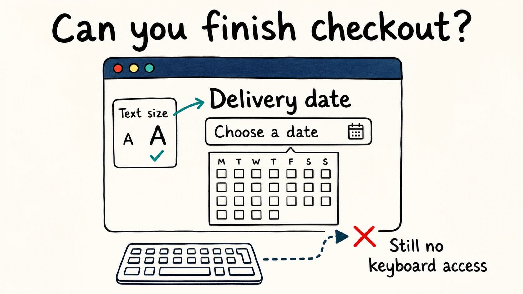
Whether a keyboard user can finish checkout, whether a screen reader user hears the error, and whether the whole flow makes sense all need time with the running product. Time is exactly what a team has least of in its final week.
An audit is a snapshot
A website keeps changing after launch: new pages, new campaigns, a redesigned component, an updated third-party script. An audit describes one version of it. Unless checks are part of how changes ship, fixed barriers return and new ones arrive.
For services covered by the European Accessibility Act, the law also looks beyond a single check. Article 13 of the Directive requires service providers to “design and provide services” in line with its accessibility requirements, and to ensure that “procedures are in place” so the service “remains in conformity” as it changes. Whether your service is covered depends on what you offer and to whom; our guide to the Act walks through the scope, exemptions and deadlines.
Does fixing accessibility late really cost more?
Articles on this topic often claim that a defect costs 100 times more to fix after release than during design. The figure is usually credited to an IBM Systems Sciences Institute study. When The Register traced the claim in 2021, drawing on research by Laurent Bossavit, the trail ended at a 1987 textbook that cited IBM training course notes rather than published research.
The wider evidence is mixed. A 2017 study of 171 software projects found no consistent evidence that issues took substantially more effort to resolve in later phases than soon after they were introduced.
So the calendar alone is not what makes a late accessibility fix expensive. What matters is how much has been built on top of the decision:
- A missing label on one search field takes the same few minutes in week two or week twenty.
- A failing gray in the design tokens has, by week twenty, reached components, templates and emails, and each one needs checking after the change.
- A custom select used in forty forms needs one repair if it is a shared component, and forty if it was copied.
- A vendor widget may be out of your hands entirely once the contract is signed.
GOV.UK's service manual makes the same point without a multiplier: “problems usually cost less to fix if you find them early.”
What we caught building this blog
This blog was built from a design handoff, and the mockup itself carried accessibility defects. Its table-of-contents links parked each heading under the sticky navigation bar, because the scroll offset sat on the wrong element. Its share links and related-article links pointed at #, links that go nowhere. We found both while building the components, fixed them there, and added tests so they cannot return. Before launch, the blog index and all seven articles passed automated axe scans in 44 page states, at desktop and phone widths. That is not proof of conformance, but neither defect ever reached a reader.
How to build accessibility in from the start
Shift-left accessibility does not mean running an audit in week one. It means each stage handles the accessibility decisions that belong to it, owned by the people who make them. W3C's draft Accessibility Roles and Responsibilities Mapping exists to help teams “assign responsibilities for digital accessibility to appropriate roles early in projects.”
| Stage | Owned by | Main accessibility work |
|---|---|---|
| Planning | Product owners | Testable acceptance criteria, budget for captions and manual testing, vendor demos with a keyboard and a screen reader |
| Design | Designers | Contrast of every text and background pair, visible focus, target size, states not shown by color alone, annotations |
| Components | Developers | Native HTML first, keyboard support, role-based tests, scans of open states |
| Content | Content authors | Alt text or a decorative choice, heading levels, captions, descriptive link text |
| Testing | Developers and testers | Keyboard, automated scan, zoom and reflow, and a screen reader for each feature |
| After launch | Whole team | Tests in the release pipeline, retests after vendor updates, an accessibility statement |
Planning: write requirements someone can test
Set a target, such as WCAG 2.2 Level AA for most new web projects, then turn it into acceptance criteria for each feature. A vague requirement gives nobody anything to build or test against:
As a shopper, I want to filter products.
The filter panel should be accessible.As a shopper, I want to filter products by size
and color.
Accessibility acceptance criteria:
- "Filters" is a button that shows and hides the
panel and reports whether it is open
(aria-expanded).
- Enter and Space open and close it. Focus stays
on the button.
- Options are checkboxes with visible labels,
grouped under visible headings such as "Size"
(fieldset and legend).
- The number of matching products is announced
when it changes, without moving focus.
- A selected filter is shown by more than color.
- Targets are at least 24 by 24 CSS pixels.
- The panel works at 320 CSS pixels wide without
scrolling sideways.Each line traces to a WCAG criterion: 4.1.2 Name, Role, Value; 2.1.1 Keyboard; 1.3.1 Info and Relationships; 4.1.3 Status Messages; 1.4.1 Use of Color; 2.5.8 Target Size (Minimum); and 1.4.10 Reflow. Written as behavior instead of criterion numbers, they can go straight into a ticket. The button itself follows the W3C disclosure pattern.
Planning is also where three easily forgotten items get a budget: captions and transcripts for video, time for manual testing, and accessibility questions in vendor selection. Ask vendors to demonstrate your own tasks with a keyboard and a screen reader before you sign. A widget you cannot change is a barrier you have bought.
Plan to involve people with disabilities, too. W3C's guidance on involving users says to address accessibility “from the earliest stage of the project,” and early sessions surface real-world problems that no checklist names.
If you build with an AI coding agent, these criteria are also the most useful part of its brief. Our guide to AI-generated code and accessibility shows a complete example.
Design: settle the expensive decisions first
Design is where many of the hardest-to-reverse decisions are made, so a review there pays off quickly. W3C's planning guidance notes that “early evaluations of designs help identify problems and potential problems before significant work takes place.” Settle these before components are built:
- Color pairs, not single colors. Test each text and background pair in your tokens, including hover, focus and error states. Our contrast guide has measured examples.
- A visible focus style for every interactive element, designed once rather than left to whatever survives the CSS reset.
- Target size and spacing that work for touch and for people with limited dexterity.
- States that do not rely on color alone: errors explained in text, selected items marked with more than a tint.
- Annotations for developers: heading levels, landmarks, reading and focus order, names for icon-only buttons and the purpose of each image.
WCAG 2.2 strengthens the case. The six Level A and AA criteria it added cover focus that is not completely hidden behind sticky headers or banners, an alternative to dragging, a minimum target size, help in a consistent place, not asking for the same information twice, and signing in without relying on memory or puzzles alone. All six are easier to meet in a wireframe or a flow diagram than in finished screens.
A sign-in page that blocks pasting a password, for example, can fail Accessible Authentication (Minimum) unless it offers an alternative. That is a product decision long before it is a line of code.
Components: build it once, test it there
Most sites are assembled from shared components, which makes them the most efficient place for accessibility work: fix the date picker once and every form that uses it improves. Start from native HTML. A button, a select or an input type="checkbox" arrives with keyboard support and the right role. Reach for ARIA when no native element can express what you need.
Then turn the acceptance criteria into tests that run with every change. This browser test walks the filter panel's keyboard path, checks the state it exposes, and scans the panel while it is open, a state that a scan of the freshly loaded page never sees:
import { test, expect } from '@playwright/test';
import AxeBuilder from '@axe-core/playwright';

test('filters work from the keyboard', async ({ page }) => {
  await page.goto('/products');

  const filters = page.getByRole('button', { name: 'Filters' });
  await expect(filters).toHaveAttribute('aria-expanded', 'false');

  await filters.press('Enter');
  await expect(filters).toHaveAttribute('aria-expanded', 'true');

  const size = page.getByRole('group', { name: 'Size' });
  await size.getByRole('checkbox', { name: 'Medium' }).press('Space');
  await expect(page.getByRole('status')).toContainText('products');

  // Scan the panel while it is open. A scan of the
  // page as it first loads never sees this state.
  const results = await new AxeBuilder({ page })
    .include('#filter-panel')
    .analyze();
  expect(results.violations).toEqual([]);

  await filters.press('Space');
  await expect(filters).toHaveAttribute('aria-expanded', 'false');
});
Locating elements by role and name has a side benefit. Playwright recommends role locators because they are “the closest way to how users and assistive technology perceive the page,” and Testing Library gives the same advice for component tests. A test written this way fails when a control loses its role or name, so an ordinary functional test catches an accessibility regression. Those roles and names are also what assistive technology and AI agents read from the accessibility tree.
Playwright is careful to add that role locators do not replace accessibility audits and conformance tests. What they give you is early feedback, which is the point.
Content: give authors the right fields
Content keeps changing long after launch, so accessibility has to live in the publishing tools. The same W3C guidance recommends that teams “incorporate accessibility checks as part of your web content publishing workflow.” In practice, set up the CMS so that:
- Every image has an alt text field and an explicit decorative option, so an empty value is a decision rather than an oversight. Our alt text guide covers what to write.
- Editors choose heading levels for structure, not for size.
- Video uploads expect captions, and audio expects a transcript.
- Link text makes sense on its own; “read more” is not a destination.
- Documents people download, including PDFs, are checked like pages, or published as HTML instead.
Testing: check every feature, not just the release
Testing becomes a habit rather than an event. GOV.UK's service manual recommends “running a combination of manual and automated tests each time you develop a new feature.” A short check per feature covers most of it:
Keyboard. Complete the feature's task with Tab, Shift+Tab, Enter, Space, Escape and the arrow keys. Watch where focus goes when something opens or closes.
Automated scan. Scan the states you changed, such as open menus, dialogs and error messages, not only the page as it first loads.
Zoom and reflow. Check the feature at 200% zoom and at 320 CSS pixels wide.
Screen reader. Listen to the names, states and announcements of the controls you changed.
At milestones, add what a per-feature check cannot: an expert review of complete journeys, and sessions with people with disabilities using their own devices and settings. W3C advises evaluating accessibility “throughout the design and development process, and particularly at key milestones and sprints.”
Automated scans are the cheapest part of this loop, so run them often: whenever a template or component changes, not only before launch. Our free scan lists each detectable failure on a page with the element and the WCAG rule it breaks. It cannot tell you whether the task works with a keyboard; that check stays with a person.
After launch: keep it from drifting
- Keep the browser tests and scans in the release pipeline, so a fixed barrier stays fixed.
- Retest when a vendor updates a widget or script you embed.
- Publish an accessibility statement that lists known issues and gives people a way to report problems, then route those reports to the team that owns the component.
- Review the statement, and the checks behind it, when your design system, CMS or main journeys change.
Already at the last stage? Start here
If launch is close and the audit is in, the decisions above can no longer be made early, but they can still be made well. W3C's first-aid guidance for interim repairs suggests prioritizing high-impact problems, meaning those on many pages, on frequently used pages or in critical processes such as purchase forms, along with low-effort ones. A practical order:
Protect the critical journeys. Fix anything that stops someone signing up, checking out or booking before anything cosmetic.
Repair the source. Change the token, component or template, not the one page where the audit noticed the problem.
Skip the shortcut. An overlay adds a layer on top of the page; it does not repair the component underneath. Our guide to what overlays fix and what they miss explains the difference.
Say what is still broken. List known issues, workarounds and planned fixes in your accessibility statement, with a contact route.
Stop the backlog growing. Add a regression test for each repaired barrier, and schedule the next project's first accessibility review during design.
The same guidance is clear that first aid is only a start: once the most critical issues are addressed, plan to integrate accessibility throughout future design and development.
Frequently asked questions
What does shift-left accessibility mean?
It means moving accessibility work earlier on a project timeline drawn from left to right, into planning, design and development rather than a final test phase. Testing at the end still happens. It is just no longer the first time anyone looks.
When should accessibility testing start?
As soon as there is something to evaluate. Designs can be reviewed for contrast, focus visibility, target size and structure before any code exists. Each feature can then be checked with a keyboard, a scan and a screen reader as it is built, with a full audit confirming the result.
Is a pre-launch accessibility audit still worth doing?
Yes, as confirmation. An expert review of complete journeys finds problems that per-feature checks miss. It works best when it brings few surprises and when there is still time to act on what it finds.
Who is responsible for accessibility on a web team?
Everyone whose decisions affect it. GOV.UK's service manual puts it plainly: “Accessibility is not the responsibility of one person.” Product owners, designers, developers and content authors each own part of it; the table under “How to build accessibility in from the start” shows which part.
Does building accessibility in from the start slow development down?
It adds some work to each feature: writing criteria, walking the keyboard path, running a scan. In exchange, it removes much of the end-of-project scramble and the rework after launch. Because the work goes into shared components and templates, each new feature built from them starts with more of it done.
AccessiLume cites primary standards and published research. Guidance checked against W3C WAI, GOV.UK and EU legislation.
- Level Access. State of Digital Accessibility Report 2025–2026: Exploring our findings. When organizations begin addressing accessibility, and how it changed from 2024.
- Level Access. State of Digital Accessibility Report 2025–2026: Methodology. 1,622 professionals surveyed by Vanson Bourne, July–August 2025.
- W3C Web Accessibility Initiative. Accessibility Roles and Responsibilities Mapping (ARRM). Draft, updated 28 October 2026.
- Microsoft. Accessibility testing. Playwright documentation.
- European Parliament and Council. Directive (EU) 2019/882. Article 13, obligations of service providers. EUR-Lex text.
- Anderson, T. Everyone cites that “bugs are 100x more expensive to fix in production” research, but the study might not even exist. The Register, July 22, 2021.
- Menzies, T., Nichols, W., Shull, F., and Layman, L. Are delayed issues harder to resolve? Revisiting cost-to-fix of defects throughout the lifecycle. Empirical Software Engineering 22, 1903–1935, 2017.
- GOV.UK Service Manual. Making your service accessible: an introduction. Last updated 17 December 2025.
- W3C Web Accessibility Initiative. Implement — Planning and Managing Web Accessibility. Updated 12 August 2026.
- W3C Web Accessibility Initiative. Involving Users in Web Projects for Better, Easier Accessibility.
- W3C Web Accessibility Initiative. What’s New in WCAG 2.2. The nine success criteria added in version 2.2.
- W3C Web Accessibility Initiative. Understanding Accessible Authentication (Minimum). Success Criterion 3.3.8, Level AA.
- W3C Web Accessibility Initiative. Disclosure (Show/Hide) Pattern. ARIA Authoring Practices Guide.
- Microsoft. Locators. Playwright documentation on role locators.
- Testing Library. About Queries. Query priority and getByRole.
- W3C Web Accessibility Initiative. Developing an Accessibility Statement.
- W3C Web Accessibility Initiative. Web Accessibility First Aid: Approaches for Interim Repairs. Updated 12 August 2026.