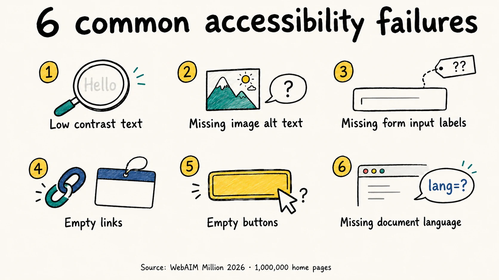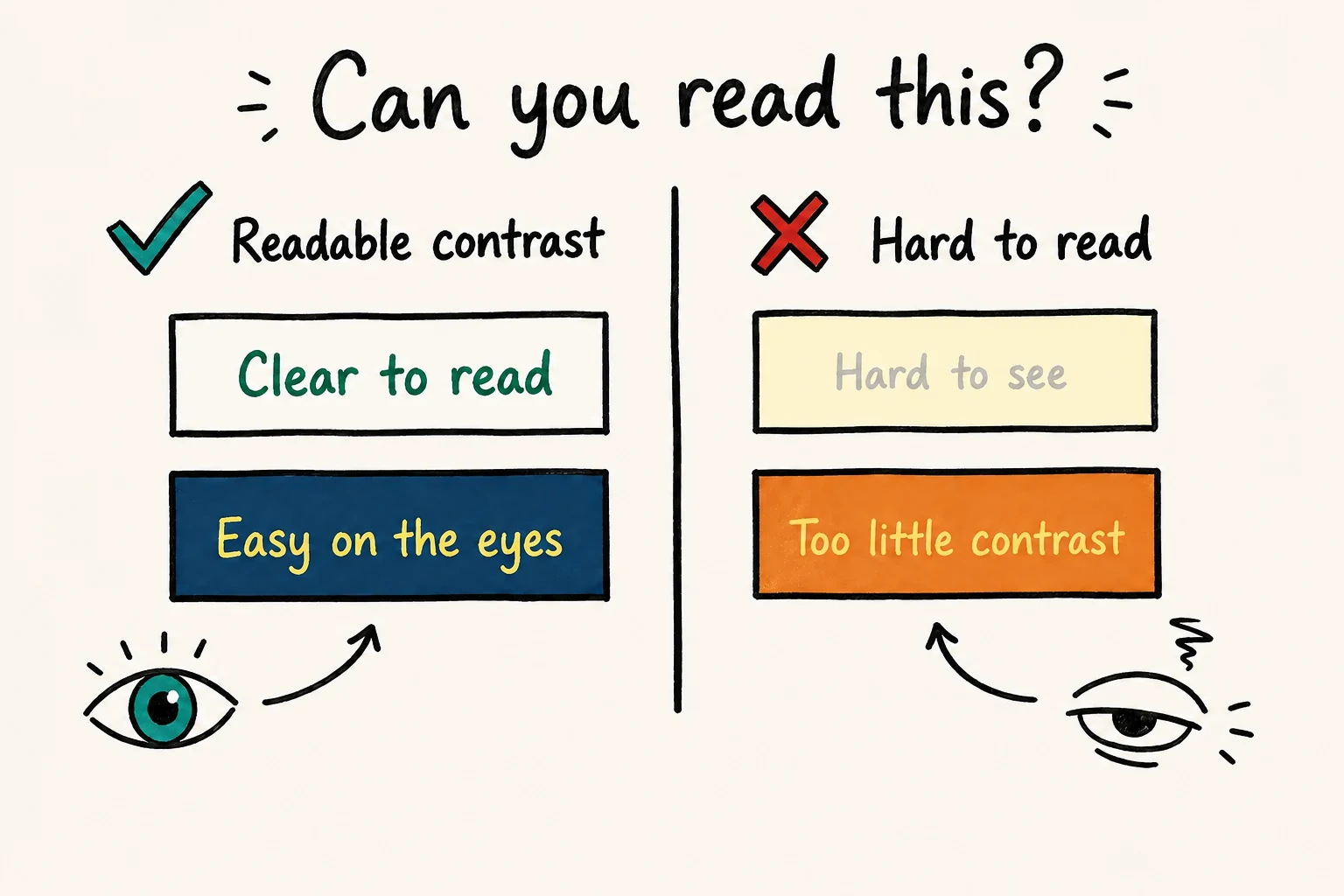
WCAG AA requires a contrast ratio of at least 4.5:1 for normal text and 3:1 for large text. If a price, form label or instruction falls below its threshold, changing the text color or its background is usually the first fix to try.
The awkward cases rarely look dramatic. Gray text can seem readable on your monitor and still fail. A brand color that works behind a dark label can fail behind a white one. This guide gives you specific pairs to check, a way to repair them, and the places where a passing number is not the whole answer.
What contrast ratio does WCAG require?
For text, use the following thresholds from WCAG 1.4.3, Contrast (Minimum) and 1.4.6, Contrast (Enhanced):
| Text size | AA minimum | AAA minimum |
|---|---|---|
| Normal text | 4.5:1 | 7:1 |
| Large text | 3:1 | 4.5:1 |
Large text means at least 24 CSS pixels, or about 18.67 CSS pixels when bold. A 20px regular-weight heading still needs 4.5:1 at AA. The heading tag itself does not qualify it for the lower threshold. W3C explains the size conversion and threshold rules.
Ratios run from 1:1 for identical colors to 21:1 for black and white. They measure relative luminance: two very different hues can still have too little light–dark difference. AAA sets a higher text-contrast target; meeting it for one label does not make the whole page AAA conformant.
Treat the minimum as a boundary, not a rounding exercise. A calculated 4.499:1 fails 4.5:1. We recommend leaving some room above the minimum, especially for small or thin text.
How to check color contrast on your website
Start with something people need to read: the delivery charge, a form instruction or the text on a purchase button. Check it in the actual page rather than copying a color from the brand guidelines.
Identify the rendered pair. Inspect the text and find its computed color and the background behind it. Check inherited styles and transparency. A transparent background on the text element means you need to look behind that element, not assume white.
Measure it. For a solid pair, enter both values in the WebAIM Contrast Checker, which also accepts foreground transparency. Select the result for the text's actual size and your target level.
Try a repair in the browser. Chrome DevTools shows contrast in its color picker. Inspect the element, open the swatch beside its CSS
color, and expand the contrast information. Adjust a color, then save the change in your stylesheet or theme; a DevTools edit alone disappears on reload.Check the other states and backgrounds. Test hover, keyboard focus, validation errors and each supported theme. If the same component appears on white, tinted and dark surfaces, test all three. Record the pair, ratio and affected component so the fix is reproducible.
An automated scan is useful for finding repeated failures. Our scans help build that repair list, but a clean report is not proof that every contrast case was evaluated. W3C's evaluation guidance calls for human evaluation as well.
Color contrast examples you can reproduce
Here are six fully opaque sRGB pairs, calculated using W3C's contrast formula. Displayed ratios are rounded to two decimals; pass/fail uses the unrounded value. These results concern normal-text AA contrast only.
| Text on background | Ratio | Normal-text AA |
|---|---|---|
#777777 on #ffffff | 4.48:1 | Fail |
#595959 on #ffffff | 7.00:1 | Pass |
#ffffff on #14b8a6 | 2.49:1 | Fail |
#0d1c19 on #14b8a6 | 7.05:1 | Pass |
#ffffff on #0f766e | 5.47:1 | Pass |
#ffffff on #115e59 | 7.58:1 | Pass |
The gray example is an easy mistake: #777777 on white falls just short. Switching that text to #595959 gives it more room without changing the layout.
The teal examples offer two different repairs. Keep the bright #14b8a6 background and use dark text, or keep white text and darken the background to #0f766e. You do not have to abandon teal. You do have to choose a pair that works.
To find a darker alternative for your own white-text button, switch the color picker to HSL, keep hue and saturation fixed, and lower the background's lightness in small steps. Re-measure against the white text after each change; for dark text on a light background, try raising the background's lightness instead.
Fix contrast without redesigning your brand
Give colors specific jobs. A bright accent used in decorative artwork does not also have to be the background for a small white button label. Keep the accent and introduce a darker action color, or use a dark label on the existing bright fill.
For a signup card on white, the darker-button option could look like this:
.signup-card {
  background: #ffffff;
  --text-muted: #595959;
  --action-bg: #0f766e;
  --action-hover: #115e59;
  --text-on-action: #ffffff;
}

.signup-card .hint {
  color: var(--text-muted);
}

.signup-card .cta {
  color: var(--text-on-action);
  background: var(--action-bg);
}

.signup-card .cta:hover {
  background: var(--action-hover);
}
This changes the color styles, not the button's semantics or keyboard behavior. Keep a visible focus indicator and check it separately. The hint gets 7.00:1 on white, while the white button text gets 5.47:1 normally and 7.58:1 on hover.
Put the fix in the shared component or theme setting that generated the failure. If fifty cards inherit the same faint text color, fifty page-level overrides are a maintenance problem. One well-scoped change is easier to review and keep.
Before changing a global variable, find where it is used. A gray that works on white is not automatically suitable for a dark footer. Name variables by their role and surface, and give dark mode its own tested values. In a website builder, the equivalent is editing the global text or button style and checking every template that uses it.
If you are considering a contrast toolbar instead, our guide to accessibility overlays explains how visitor preferences differ from repairs to the site's own styles and behavior.
Contrast checks that need a closer look
Text over photos, gradients and video
A background image has no single contrast value. Test the areas directly behind the letters, including the weakest part of a gradient. Responsive cropping can move a bright part of a photograph behind text that was clear on desktop.
For a dependable fix, put the text on a solid panel. A scrim or halo can also work, but its resulting contrast needs checking. W3C's G18 technique describes these approaches. With moving video or changing imagery, a fully opaque panel removes the changing background from the text-contrast calculation.
Transparency and faint font strokes
Setting color: #595959 does not guarantee the table's 7.00:1 if a parent also has opacity: 0.5. The final appearance includes the underlying surface. Inspect the composited result rather than checking the opaque hex value alone.
For ordinary CSS text, measure the specified foreground and background colors, not the softened edge pixels in a screenshot. Thin strokes can still look faint even with a passing pair; W3C recommends stronger strokes or extra contrast in that situation.
Dark mode
Repeat the check with the theme actually enabled. Look especially at secondary text, placeholders, error messages and components embedded from another provider. Changing the page background leaves any hardcoded text colors untouched.
Keep a small record of tested pairs for each theme. That gives the next person changing the palette an answer more useful than “this gray is accessible.”
Good contrast does not replace clear links and errors
A red error message can pass its contrast check while a form still relies on color alone to identify the invalid field. Add an explanation such as “Enter a valid email address,” and associate it with the field. Similarly, label chart series or use distinguishable patterns rather than asking readers to separate colors unaided. These address WCAG's Use of Color requirement.
For links inside paragraphs, our recommendation is to keep the underline. The link text still needs sufficient contrast against the background. If you remove that visual cue and distinguish links only by color and lightness, W3C's G183 technique uses at least 3:1 between link text and surrounding text. That is a different comparison from text against its background.
We also recommend a non-color cue on hover and keyboard focus, such as an underline. The current G183 technique does not make that additional cue a condition of its 3:1 method, but it makes the interaction easier to recognize.
Frequently asked questions
Does gray text fail WCAG?
No. The pair matters: #595959 on white passes normal-text AA, while #777777 on white fails. Check the actual background and any transparency before reusing either result.
Do placeholders and small helper text need to pass?
Yes. Text does not get an exemption because it is secondary, temporary or less prominent. W3C explicitly includes placeholder text. A faint placeholder is also a poor substitute for a persistent form label.
Are disabled buttons and logos exempt?
Text in genuinely inactive controls and text that is part of a logo or brand name are exceptions under WCAG 1.4.3. An enabled button styled to look disabled is still active. The logo exception does not extend to every heading or button using a brand color.
Does passing contrast make a website accessible?
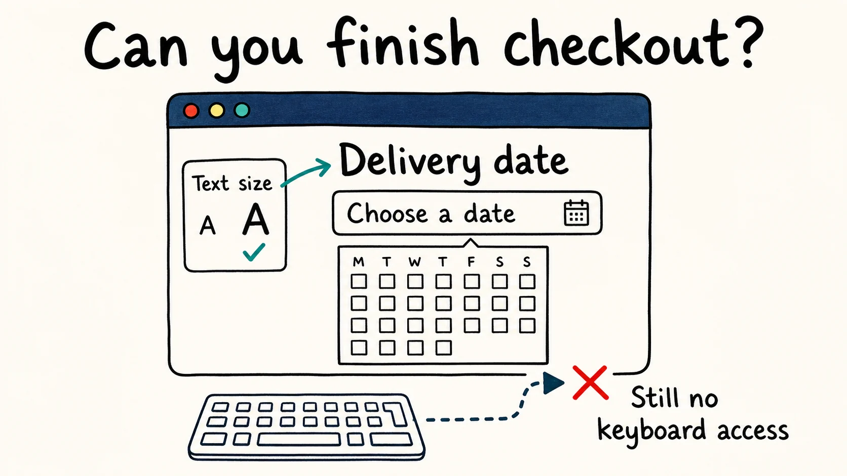
No. It addresses particular visual requirements. People still need usable labels, keyboard operation, understandable errors and a way to complete the task. After repairing contrast, use our common WCAG failures guide to check the other recurring problems.
See which of these failures your own page has
One URL, one scan, and the exact element plus the rule it breaks — no signup needed for the first report.
Run a free scanAccessiLume cites primary standards and published research. Requirements checked against W3C WCAG 2.2; example ratios calculated from sRGB values.
- W3C. WCAG 2.2 — Contrast (Minimum). Success Criterion 1.4.3, Level AA.
- W3C Web Accessibility Initiative. Understanding Contrast (Minimum). Text size, exceptions and testing notes.
- W3C Web Accessibility Initiative. Understanding Contrast (Enhanced). Success Criterion 1.4.6, Level AAA.
- W3C Web Accessibility Initiative. Understanding Non-text Contrast. Success Criterion 1.4.11, Level AA.
- W3C Web Accessibility Initiative. Understanding Use of Color. Success Criterion 1.4.1, Level A.
- W3C Web Accessibility Initiative. Understanding Focus Appearance. Success Criterion 2.4.13, Level AAA.
- W3C Web Accessibility Initiative. Understanding Focus Not Obscured (Minimum). Success Criterion 2.4.11, Level AA.
- W3C Web Accessibility Initiative. G18: Ensuring at least 4.5:1 contrast between text and its background. Calculation method and image-background techniques.
- W3C Web Accessibility Initiative. G183: Distinguishing inline links from surrounding text.
- WebAIM. Contrast Checker. Utah State University.
- Chrome for Developers. Make your website more readable. Finding and fixing contrast issues in DevTools.
- W3C Web Accessibility Initiative. Evaluation Tools Overview. The role and limits of automated checks.