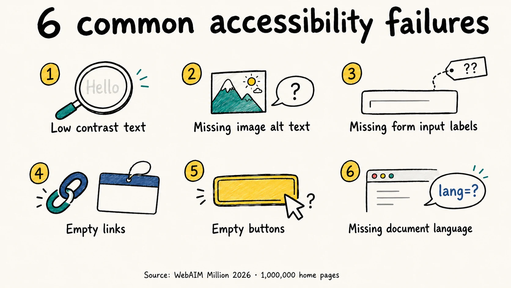
A missing form label can leave someone guessing what to enter. An unnamed button can hide what an action does. The six fixes below address common WCAG (Web Content Accessibility Guidelines) failures, with HTML and CSS you can use in your own components.
These six error types accounted for 96% of errors detected in the 2026 WebAIM Million study, which tested one million home pages with WAVE in February 2026. The figures cover that sample and tool, not every accessibility barrier on the web.
The six failures at a glance
| Failure | Share of home pages | Direction since 2025 |
|---|---|---|
| Low contrast text | 83.9% | Worse (was 79.1%) |
| Missing image alternative text | 53.1% | Better (was 55.5%) |
| Missing form input labels | 51.0% | Worse (was 48.2%) |
| Empty links | 46.3% | Worse (was 45.4%) |
| Empty buttons | 30.6% | Worse (was 29.6%) |
| Missing document language | 13.5% | Better (was 15.8%) |
Each percentage is the share of tested home pages with that error type; one page can have several types. Four of six became more prevalent since 2025.
The state of the web in 2026
The share of home pages with detected failures rose in 2026, reversing six years of small annual improvements in that measure.
- 95.9% of the top one million home pages had detectable WCAG 2 A/AA failures, up from 94.8% in 2025.
- Pages averaged 56.1 detected errors, a 10.1% increase year over year.
- Home pages averaged 1,437 elements, up 14.3% in a single year.
- 3.9% of all page elements carried a detected error — roughly one element in every 26.
That density is an average across the sample; the barriers someone encounters depend on the page and the task.
The remaining 4.1% had no errors that WAVE detected, which does not establish that they passed WCAG.
The six failures
1. Low contrast text — 83.9% of pages
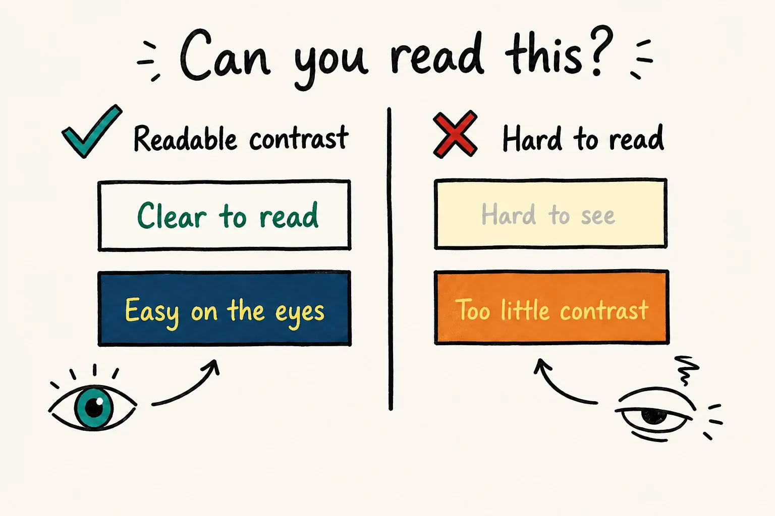
What it is. Text that does not meet WCAG 1.4.3: 4.5:1 for normal text and 3:1 for large text, meaning at least 24 CSS pixels or about 18.7 CSS pixels when bold. Non-text contrast is a separate requirement. For more examples, see our WCAG color contrast guide.
Scale. The most common failure by a wide margin, up from 79.1% in 2025. Across the full sample, home pages averaged 34 distinct instances each, a 15% rise.
Why it happens. A pale grey chosen for secondary text gets reused in cards, forms and footers. Or a brand color passes on white but fails on a tinted background. If the color comes from a shared design token, the same mistake can spread across the site.
The fix.
--color-text-muted: #949494;--color-text-muted: #767676;For an opaque, 8-bit RGB grey on pure white, #767676 just clears 4.5:1; #777777 lands at 4.48:1 and fails. That small difference matters because WCAG ratios are not rounded up to a pass.
Be careful when reusing that grey. It measures 4.54:1 on white, but only 4.17:1 on an #f5f5f5 panel and 3.71:1 on an #e8e8e8 card. For text over a photograph, a solid backing or a dark overlay can help keep the background predictable.
How to check. Automated tools handle the common case well, because contrast is computed from rendered styles. They are much weaker wherever the background is not a solid color: text over a photograph, a gradient or video usually comes back as needs review rather than pass or fail, because the tool cannot decide which pixels sit behind the text. That judgment stays with a person. Test hover, focus and visited states separately too — most tools only sample the default state.
WCAG 1.4.3 exempts text in inactive controls from its contrast requirement. Low contrast on a genuinely disabled button is therefore not a failure of this criterion. That exemption does not cover enabled controls merely styled to look disabled, or rule out other accessibility issues.
Where to start. When the same failing color comes from a shared design token, fixing that token can improve many pages at once. Recheck it against every background where it is used.
2. Missing image alternative text — 53.1% of pages
What it is. An <img> with no alt attribute. Screen readers fall back to announcing the filename, or nothing.
Scale. Slightly improved but still on more than half of home pages. Pages averaged 66.6 images each, and 16.2% of all images were missing alt text — about 10.8 per page.
Two details deserve attention:
- 45% of the images missing alt text were linked images. When the image is the link's only content and no other accessible name is supplied, this also leaves the link unnamed.
- A further 10.8% of images with alt text had questionable or repetitive descriptions, such as "image", a filename or duplicated adjacent text. These need contextual review rather than an automatic verdict that each description is wrong.
The fix.
<img src="/img/DSC_04412.jpg"><!-- Decorative: correctly skipped -->
<img src="/img/divider-flourish.svg" alt="">
<!-- Informative: describes meaning, not appearance -->
<img src="/img/chart-q3.png"
alt="Q3 revenue rose 12% to €4.2M, the third consecutive quarterly increase">
<!-- Linked image: alt describes the destination, not the picture -->
<a href="/cart">
<img src="/img/cart-icon.svg" alt="Shopping cart, 3 items">
</a>When an image supplies the link's name, its alt text should communicate the destination or purpose. "Shopping cart" is clearer than "cart icon". If the link already contains equivalent visible text, an empty alt attribute can avoid repetition. See our guide to writing alt text for more examples.
For a decorative <img>, use alt="" so screen readers can skip it. Leaving out the attribute can cause the filename to be announced instead.
How to check. A scan finds missing attributes reliably. Then read the descriptions in context: would someone who cannot see the image get the information they need?
3. Missing form input labels — 51.0% of pages
What it is. An <input>, <select> or <textarea> with no programmatic label. The control exists, but nothing tells software what it is for.
Scale. On more than half of home pages, and rising. Pages averaged 6.9 form inputs, and a third of them — 33.1% — were not properly labeled by any accepted method.
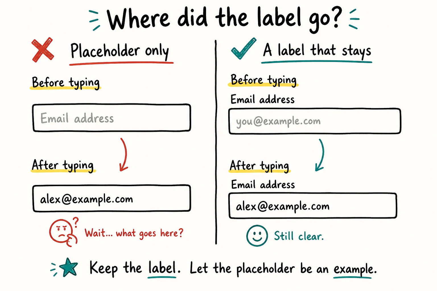
Why it happens. Placeholder text is used instead of a label. It disappears when a value is entered and is not a reliable substitute for a persistent, programmatically associated label. Search fields, newsletter signups and filter controls are common places to check.
The fix.
<input type="email" placeholder="Your email"><!-- Best: visible label, explicitly associated -->
<label for="newsletter-email">Email address</label>
<input type="email" id="newsletter-email" placeholder="you@example.com">
<!-- Acceptable when the design genuinely cannot show a label -->
<input type="search" id="site-search" aria-label="Search products">
<!-- Reusing existing visible text -->
<span id="qty-label">Quantity</span>
<input type="number" id="qty" aria-labelledby="qty-label">If you must hide the label, hide it visually rather than removing it:
.visually-hidden {
  position: absolute;
  width: 1px; height: 1px;
  padding: 0; margin: -1px;
  overflow: hidden;
  clip: rect(0 0 0 0);
  white-space: nowrap;
  border: 0;
}
Prefer a visible label so people can see which words to use with voice control. Hidden text and aria-label can supply a name that speech software uses, but that name may be difficult to discover. When a control has a visible text label, include that wording in its accessible name, as required by WCAG 2.5.3: Label in Name.
How to check. Scan for missing labels, then inspect the accessible names in your browser. A field named "input" may have a name, but it still doesn't tell anyone what to enter.
4. Empty links — 46.3% of pages
What it is. An <a> element with no accessible name. Nearly half of all home pages have at least one.
Why it happens. Social media and cart links often contain only an icon. Without text or another accessible name, a screen reader may announce "link" or read the URL. Use a button for actions such as closing a dialog; use a link for navigation.
The fix.
<a href="/cart"><i class="icon-cart"></i></a>
<a href="https://twitter.com/example"><svg>...</svg></a><a href="/cart">
<i class="icon-cart" aria-hidden="true"></i>
<span class="visually-hidden">Shopping cart</span>
</a>
<a href="https://twitter.com/example" aria-label="AccessiLume on Twitter">
<svg aria-hidden="true" focusable="false">...</svg>
</a>Two conventions worth adopting as house rules. Mark decorative SVGs aria-hidden="true" and focusable="false" so they do not leak into the tree or the tab order. And never ship a link labelled "click here" or "read more" without context — 15.2% of pages had ambiguous link text, up from 13.7%, averaging 5.3 instances per page.
For a link whose only content is an unnamed image, useful alt text can fix both the missing image description and the missing link name.
5. Empty buttons — 30.6% of pages
What it is. A button with no accessible name.
Scale. Nearly a third of home pages, up from 29.6% in 2025.
Why it happens. Two problems are worth checking here: buttons without names, and clickable elements that don't behave like buttons.
The first is the same icon problem as empty links: a <button> containing only an SVG or icon font. The element is a button, the tool finds it, and it reports the missing name. That is the failure in the statistic.
The second is a <div> with a click handler but no button role or keyboard support. The 30.6% figure does not measure the prevalence of these custom controls. A tool checking button names may miss them, although other automated checks can flag some suspicious click handlers. Manually verify that every action works with a keyboard and exposes the correct role and name.
The fix.
<button><svg class="icon-close">...</svg></button>
<div class="btn-primary" onclick="submitOrder()">Place Order</div><button type="button" aria-label="Close dialog">
<svg aria-hidden="true" focusable="false">...</svg>
</button>
<button type="submit">Place Order</button>A native <button> supplies keyboard activation on Enter and Space, focusability, the correct role, and disabled semantics. Recreating that on a <div> requires additional markup and behavior. Moving focus after an action, such as opening or closing a dialog, still needs explicit handling.
Clear roles and names also make controls easier for browser testing tools and AI agents to locate reliably. Tools using other selectors may still find a clickable <div>, but it will not behave like a native button. Read more about why AI agents need accessible HTML.
6. Missing document language — 13.5% of pages
What it is. No lang attribute on <html>.
Scale. Down from 33.1% in 2019. On a site with one main language, this is usually a quick template fix.
Why it matters. Screen readers select a pronunciation engine from this attribute. Without it, German text may be read with English phonetics — technically audible, practically unusable.
The fix.
<html><html lang="en">
<p>The German term is <span lang="de">Barrierefreiheit</span>.</p>Set the default language in your page template. The example is an English page containing a German term; a page written in Austrian German would use lang="de-AT" on <html> instead.
Why did detected accessibility errors rise in 2026?
Larger pages and growing ARIA use accompanied the increase. Both deserve attention, although the study does not establish how much either contributed.
Pages got bigger. The average home page grew 14.3% in elements in one year, and has nearly doubled in seven. More elements means more surface area for error.
ARIA grew faster than the pages did. Home pages averaged 133.6 ARIA attributes, up 27% in a year and more than six times the 2019 figure. 82.7% of pages now use ARIA.
And ARIA correlates with more errors, not fewer. Pages using ARIA averaged 59.1 detected errors against 42 for pages without — about 17 additional barriers. WebAIM is careful to note this is correlation, since ARIA-using pages are also more complex. But the pattern is consistent and it points at a real failure mode: ARIA layered on top of non-semantic markup to patch what a native element would have handled. Of the 5.7% of pages that had an ARIA menu, 22% introduced barriers through incomplete menu markup and interactions.
The first rule of ARIA remains: do not use it if a native HTML element does the job.
WebAIM's own conclusion also names a newer suspect. It attributes the reversal to broader shifts including heavier reliance on third-party frameworks and libraries, and automated or AI-assisted coding practices — "vibe coding", in their words. That is a careful hypothesis rather than a proven cause, but it comes from the team that measured the decline.
Does your framework affect accessibility?
Your framework shapes the components and defaults you work with, but implementation matters too. WebAIM's technology comparisons can suggest what to audit; differences in site size, purpose and implementation mean they are not a ranking of framework accessibility. The sample-wide average was 56.1 errors per home page.
| JavaScript framework | Average errors per home page |
|---|---|
| Astro | 9.0 |
| Next.js | 40.9 |
| React | 43.5 |
| Nuxt.js | 54.7 |
| Vue.js | 64.6 |
| AngularJS | 76.6 |
| CMS or site builder | Average errors per home page |
|---|---|
| Adobe Experience Manager | 29.9 |
| Squarespace | 33.0 |
| Wix | 33.3 |
| Drupal | 41.2 |
| WordPress | 52.8 |
Home pages using Shopify averaged 75.1 errors, Magento 75.8, and PrestaShop 143.2.
Pages using jQuery, Swiper, jQuery UI, FancyBox and SweetAlert2 also had above-average error counts. Audit the rendered carousel, lightbox and modal to find whether a problem comes from the library, its configuration or your own code before replacing a dependency.
Two more findings worth knowing: pages using most of the popular ad systems carried more errors than average, and the 9.6% of pages running reCAPTCHA averaged 7.7 more errors than the norm.
A React site can be excellent and an Astro site can be terrible. Use your own findings to prioritize work across both dependencies and application components.
Where to start fixing your site
Use this as a starting checklist. A barrier that prevents someone from completing a key task, such as submitting a form, takes priority over an easy cosmetic fix.
Document language. Check the shared page template and any language-specific routes.
Color contrast. Start with reused text colors, then check their backgrounds and interaction states.
Form labels. Work through search, signup, checkout and other forms, including their error states.
Empty links and buttons. Check shared icon buttons, social links, cart links and carousel controls.
Alt text. Review images in context. Start with images that are the only content of a link.
Dependencies. Test your actual carousels, dialogs and embedded widgets before replacing a library.
Automated testing. Add checks to continuous integration (CI) so a later change is less likely to bring back the same errors.
Start with a free accessibility scan to identify detectable issues on one page, then check the interactions and content manually.
What this list does not cover
Check whether people can complete tasks with a keyboard, whether focus moves in a sensible order, and whether headings and image descriptions explain the content. These checks need human judgment. Tools can flag some warning signs, such as skipped heading levels, but those findings need context. Multiple <h1> elements alone do not establish a WCAG failure.
After fixing the scan findings, test important tasks with a keyboard and assistive technology. A clean scan alone is not proof of conformance.
Frequently asked questions
What are the most common WCAG failures?
Low contrast text, missing image alternative text, missing form input labels, empty links, empty buttons, and missing document language. Together these six accounted for 96% of errors detected by WAVE in the 2026 WebAIM Million study.
How many websites fail WCAG?
95.9% of the top one million home pages had automatically detectable WCAG 2 A/AA failures in February 2026. Because automated tools cannot detect every failure, the true conformance rate is lower than the remaining 4.1%.
Can an automated scan prove my site is WCAG compliant?
No. Automated tools detect only some failures. A clean result needs to be followed by manual checks of content and interactions before you can assess conformance.
Which single fix improves accessibility the most?
Fixing color contrast in shared text styles is often a good starting point: changing one design token can improve many pages. But fix barriers that prevent essential tasks, such as a keyboard trap or an unusable checkout, before less urgent issues.
See which of these failures your own page has
One URL, one scan, and the exact element plus the rule it breaks — no signup needed for the first report.
Run a free scanAccessiLume cites primary standards and published research. Statistics verified against the 2026 WebAIM Million.
- WebAIM. The WebAIM Million — 2026 Report. Utah State University. February 2026 data, published March 2026.
- W3C. Web Content Accessibility Guidelines (WCAG) 2.2. December 2024.